UX project: Kindle product Channel
This concept page became a "drive-by" campaign whereby customers would get a taste for discovering new products as well as be able to access current and relevant titles. In conjunction with exploring new games, geo location would be added to suggest products nearby.
Step 1.

I made a list of required key features above the fold alongside a list of features still important but sent below the fold. Once that list was made, I had a reference for initial layout restraints.
Step 2.

Already familiar with traditional layouts, I went to work on considering hierarchy top to down. What should be the "headline" of the page? What information should be right below it? Should the layout get smaller or smaller, or contract and expand as the page was slide farther down below the fold? Once I had an approved layout wireframed, it looked something like this:
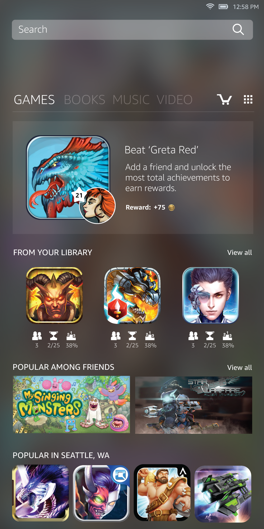
Step 3.
Now the real fun begins. I fill in the wire framed version with real product. I had to take into consideration many things including interactive animation, typography, size of image versus size of icons, etc. These are four variations. Version 3 adds the blue line to explain what goes above and below the fold:


Reward Concept
To further the experience of creating an enticing UX experience, we considered adding rewards to our meta-game concept:
